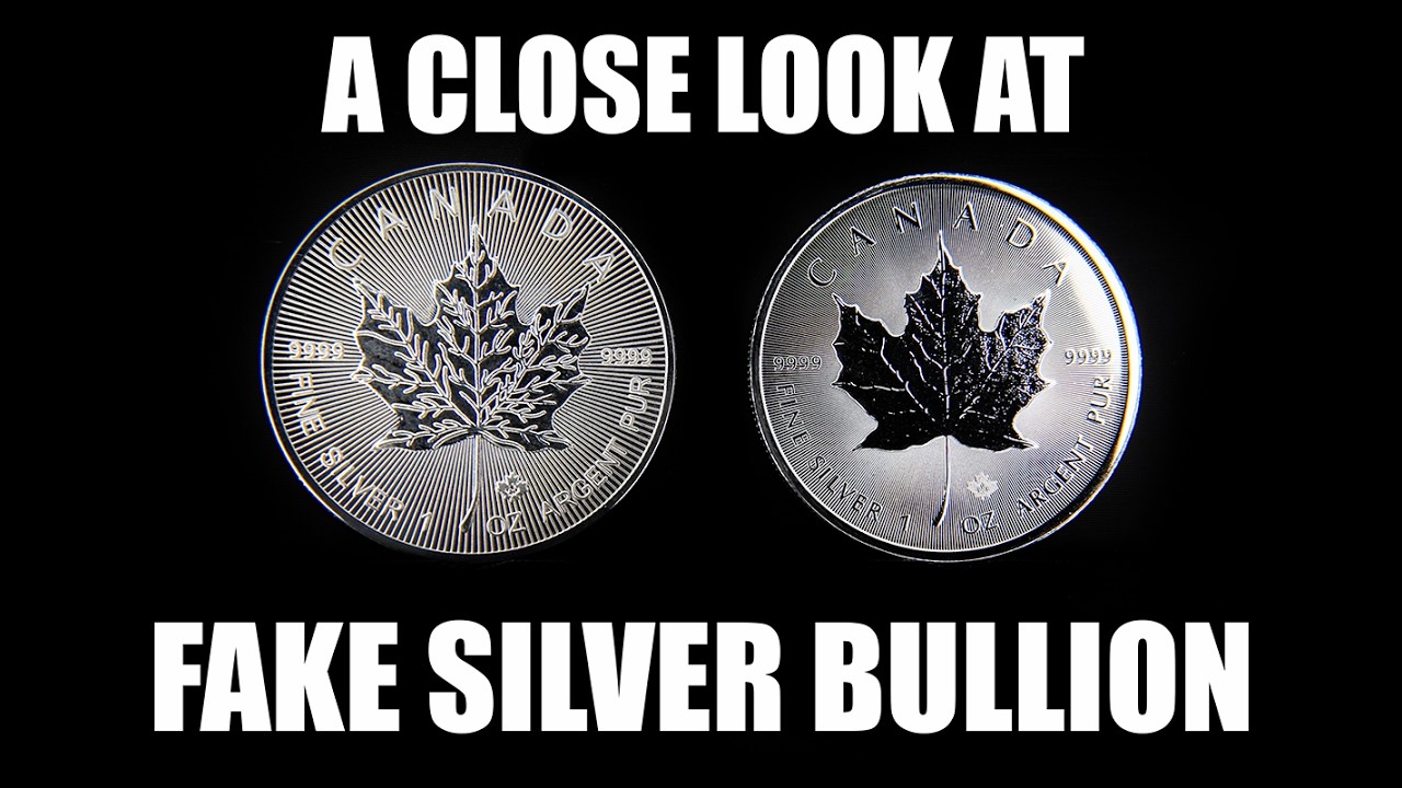
Some counterfeit silver looks crude. Some looks convincing until it sits beside the genuine article. In this video I use close visual comparisons to show the differences a buyer might otherwise overlook. The exercise is about appearance; a good-looking coin still needs more than a photograph to establish what it is made from.
Compare the exact design
The examples include Maple Leafs, Britannias, Type 2 American Silver Eagles, Philharmonics, Krugerrands, Buffalo rounds, a Kookaburra with a Goat privy and a Perth Mint Kangaroo bar. Each has its own details, so a general impression of “looking like silver” is not enough.
Look at lettering, spacing, borders, relief, reeding and the relationship between polished and textured areas. Where security features are part of a particular issue, understand how they should appear on that issue. A feature introduced in one year should not be assumed to exist on every earlier coin.
Good light helps
I use a magnifying-glass stand with built-in lighting to make fine details easier to examine. It also makes the exercise more enjoyable: the same close attention that exposes a poor copy can reveal the craftsmanship in a genuine coin.
Finish and lustre can be revealing, but they are not conclusive in isolation. Wear, toning, handling and differences between legitimate issues can change a surface. Buffalo rounds deserve particular care because genuine private-mint designs vary.
Appearance is one layer of checking
The published description records that the fake examples failed Sigma testing and had incorrect weights and dimensions. Those results support these particular comparisons; they do not mean every fake can be rejected with one identical test.
Use the visual inspection alongside reliable specifications, measured weight and dimensions, and appropriate non-destructive testing. Buy from a source you can assess, inspect purchases when they arrive and keep the transaction evidence. The aim is informed confidence, rather than either panic or reliance on a single reassuring sign.


